
Tuesday, 15 October 2013
Monday, 14 October 2013
Readership Profile
Readership Profile
Client Profile
Name:
Alice
Age: 17
years old
Gender:
Female
Occupation: Alice
is a student currently studying A Levels; she also works part time at HMV.
Alice dreams of having a future career involved in either the media, writing
for a music magazine or being a part of the music industry herself either as a
solo artist or in a band.
Disposable
income: Alice spends her disposable income on band merchandise,
tickets or CDs and typical teenage girly things like clothes, shoes and makeup.
She is also saving some of her money to put towards her first car.
Interests:
· -
Going to local music gigs.
· -
Spending time with friends and family.
· -
Enjoys photography and photo editing.
· -
Playing the guitar and singing.
Brands
& Stores:
· -
Apple
· -
Canon
· -
Topshop
· -
H&M
· -
MAC

Initial Ideas for My Music Magazine
Initial Ideas for My
Music Magazine
Grunge/Rock
Potential
Name: Audacious
Style
The main house style and theme I have chosen for this particular magazine idea is very dark, chaotic and rebellious. This is because this is the typical image that comes to mind when somebody says grunge or rock. I would use colours such as black, greys and reds. These colours have connotations of being dangerous, reckless and bold which is the exact theme idea I am aiming for.
The main house style and theme I have chosen for this particular magazine idea is very dark, chaotic and rebellious. This is because this is the typical image that comes to mind when somebody says grunge or rock. I would use colours such as black, greys and reds. These colours have connotations of being dangerous, reckless and bold which is the exact theme idea I am aiming for.
Target
Audience
The target audience for this magazine is older teenage girls, around the ages 16-20. This is because there is no other magazine in the market that targets this age group and gender with this genre of music. Although the colour scheme isn’t feminine, the articles and artists included will make it appeal to a female audience, just with a bit of an edge.
The target audience for this magazine is older teenage girls, around the ages 16-20. This is because there is no other magazine in the market that targets this age group and gender with this genre of music. Although the colour scheme isn’t feminine, the articles and artists included will make it appeal to a female audience, just with a bit of an edge.
What is
included?
The magazine will include exclusive articles, album reviews, posters of bands and artists, tour and gig dates and anything significant that is happening with well-known and established bands in the genre.
The magazine will include exclusive articles, album reviews, posters of bands and artists, tour and gig dates and anything significant that is happening with well-known and established bands in the genre.
What makes
it different?
The fact there is no other magazine in the market that compares to this exact genre that appeals to the chosen target audience, let alone any target audience.
The fact there is no other magazine in the market that compares to this exact genre that appeals to the chosen target audience, let alone any target audience.
Indie/Alternative
Potential
Name: Pocket Daydream
Style
The main theme I have chosen for this idea of music magazine is a very mature and sophisticated style. Soft neutral colours such as browns, greys, greens and light blues will be used with black for the main text colour. I decided to choose these colours because it would make the magazine look simple and light hearted, which is what it is intended to be. The colours aren’t in your face and bold, they are pastel and calm portraying a relaxed atmosphere. These colours will be used by in photographs as well as text, making an all over neutral house style.
The main theme I have chosen for this idea of music magazine is a very mature and sophisticated style. Soft neutral colours such as browns, greys, greens and light blues will be used with black for the main text colour. I decided to choose these colours because it would make the magazine look simple and light hearted, which is what it is intended to be. The colours aren’t in your face and bold, they are pastel and calm portraying a relaxed atmosphere. These colours will be used by in photographs as well as text, making an all over neutral house style.
Target
Audience
I think a target audience of teenagers interested in this genre of music is appropriate for this magazine. Especially as indie/alternative music is growing in popularity due to festivals with the younger generation. Teenagers are usually looking to break-out of their ‘shell’ and find their own sense of style, this magazine is perfect for anyone interested in the type of music and the festival type scene. If my magazine had to lean towards a particular gender it would be female, simply because there isn’t another magazine that is popular with teenage girls in this genre.
I think a target audience of teenagers interested in this genre of music is appropriate for this magazine. Especially as indie/alternative music is growing in popularity due to festivals with the younger generation. Teenagers are usually looking to break-out of their ‘shell’ and find their own sense of style, this magazine is perfect for anyone interested in the type of music and the festival type scene. If my magazine had to lean towards a particular gender it would be female, simply because there isn’t another magazine that is popular with teenage girls in this genre.
What is included?
Inside the magazine will be information on up-and-coming bands in the genre, tour and gig dates and posters etc.
Inside the magazine will be information on up-and-coming bands in the genre, tour and gig dates and posters etc.
What makes
it different?
If I were to make the magazine I would make the sizing A5 instead of A4, this is because it makes it more unique and ties in to the name of “Pocket Daydream”.
I decided on this potential name because it’s like you’re escaping out of the busy school/work lifestyle and loosing yourself into the magazine, and going into a daydream.
It is different to a lot of magazines because of the target audience and style of genre, there is no other magazine that is established and hugely popular with teenage girls for indie/alternative.
Pop
Potential
Name: New Wave
Style
I chose a colour scheme of pink, purple, red and white. This is because it will make the magazine look girly and informal. For main text I would use reds or purples because these are the darker colours chosen and I want to avoid black as much as possible, unless there are some exceptions (against a patterned background). It will have a light hearted feel to it and won’t be too heavy and loud.
I chose a colour scheme of pink, purple, red and white. This is because it will make the magazine look girly and informal. For main text I would use reds or purples because these are the darker colours chosen and I want to avoid black as much as possible, unless there are some exceptions (against a patterned background). It will have a light hearted feel to it and won’t be too heavy and loud.
Target
Audience
Target audience can include anybody who enjoys this type of genre or artists included. Mainly targeted towards girls, an appropriate age range of 11-14. I decided to choose a slightly younger target audience because they are the audience usually interested in this type of music genre.
Target audience can include anybody who enjoys this type of genre or artists included. Mainly targeted towards girls, an appropriate age range of 11-14. I decided to choose a slightly younger target audience because they are the audience usually interested in this type of music genre.
What is
included?
This magazine would include a 65% images and 35% text. This is so it appeals to a younger audience who don’t want to read as much information.
It will also include exclusive interviews and articles, the UK top 40 music chart, posters of popular artists at the time and freebies.
This magazine would include a 65% images and 35% text. This is so it appeals to a younger audience who don’t want to read as much information.
It will also include exclusive interviews and articles, the UK top 40 music chart, posters of popular artists at the time and freebies.
Monday, 30 September 2013
Music Magazine Analysis- Q

Masthead
The masthead for “Q” is very simple and clear. It is white and red, this makes it stand out and appear bold. As it is short, it is memorable and recognisable to people, so it would not be hard to spot on the store shelf. The font is slightly cursive which suggest it to be for older, mature audiences as it has a more formal feel about it.
The masthead for “Q” is very simple and clear. It is white and red, this makes it stand out and appear bold. As it is short, it is memorable and recognisable to people, so it would not be hard to spot on the store shelf. The font is slightly cursive which suggest it to be for older, mature audiences as it has a more formal feel about it.


Straplines
“Q” is more traditional when it comes to straplines. It has a lot, spread around the cover of the magazine. This strapline includes Fleetwood Mac, an older band that only older readers may be familiar with. However, along the bottom there is an article about the Sugababes, who may still be older in the sense that music is adapting and evolving rapidly but they are still fairly well known and heard off, particularly with a slightly younger audience. This conveys how wide-range this magazine is. It still has a staple target audience of young adults, interested in music knowledge, but it could openly appeal to many different kinds of people. The colours and fonts of the straplines are bold and clear. It makes the cover look orderly, but still informal and casual. The colours aren’t aimed at either genders, it’s purely for design and boldness.
“Q” is more traditional when it comes to straplines. It has a lot, spread around the cover of the magazine. This strapline includes Fleetwood Mac, an older band that only older readers may be familiar with. However, along the bottom there is an article about the Sugababes, who may still be older in the sense that music is adapting and evolving rapidly but they are still fairly well known and heard off, particularly with a slightly younger audience. This conveys how wide-range this magazine is. It still has a staple target audience of young adults, interested in music knowledge, but it could openly appeal to many different kinds of people. The colours and fonts of the straplines are bold and clear. It makes the cover look orderly, but still informal and casual. The colours aren’t aimed at either genders, it’s purely for design and boldness.

Dominant Image
The main image is Kings of Leon. The strapline says “It’s the comeback story of a lifetime”. Kings of Leon are beginning a new tour after working on the new album for such a long time. Having them as the dominant image helps promote them, the tour and the new album. Kings of Leon also have a large following of fans, making the magazine appeal to a lot of people due to them being so popular.
Music Magazine Analysis- Kerrang

Masthead
“Kerrang!” is a noise a guitar makes. Suggests it’s loud, chaotic and out there. Relates to the genre of music that will be in the magazine, it will include guitars. The font has a shattered glass look, making the magazines image appear rebellious and reckless. The explanation mark adds enthusiasm, and once again conveys the idea of the masthead being shouted. Some artists’ heads cover part of the masthead. This proves the magazine is established and well known by many people, so they aren’t risking anything by covering part of the title.
“Kerrang!” is a noise a guitar makes. Suggests it’s loud, chaotic and out there. Relates to the genre of music that will be in the magazine, it will include guitars. The font has a shattered glass look, making the magazines image appear rebellious and reckless. The explanation mark adds enthusiasm, and once again conveys the idea of the masthead being shouted. Some artists’ heads cover part of the masthead. This proves the magazine is established and well known by many people, so they aren’t risking anything by covering part of the title.
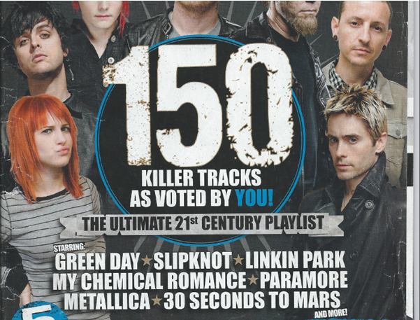
Includes many different artists’ the issue will involve. In bold font in the centre it states the main article and how it links with all the images around the outside. There isn’t one main, dominant image, but a lot of little ones. This makes it appeal to a lot of people, as there are different band members from different styles of genre of rock music all pictured. It also lists off the bands mentioned inside, all contributing to the idea of attracting and appealing to the target audience. There are bands from different eras of rock music. For example, Slipknot and Metallica are older bands, who will appeal more to the older reader, possibly a more male audience. Whereas Paramore, Green Day and My Chemical Romance are popular with both genders and slightly younger, teenage audiences. Although the background is dark and the majority of the artists clothing is dark, they stand out and are recognisable. They are all making eye contact which portrays a sense of it being personal to the reader. The dark colours of the clothing and the background also lead back to rebellious side and not being perfect, which the masthead also suggests.

Sunday, 15 September 2013
Final Analysis
Analysis – My Problem Page
14th September 2013
·
For
my problem page I used basic conventions that other magazines use for their
problem pages. For example, a main image of the “agony aunt”. I decided to use
an image of the agony aunt because it makes the advice more personal. You know
who is trying to help you out which gives a sense of relief and knowing you can
rely on what is being said. This is why I made sure the picture was looking
directly at the reader; it makes it 100% more personal and direct.
·
Another
convention I used was feminine colours. I decided to go for light pastel pinks,
purples and blues because they are more associated with the female gender which
is who my magazine is aimed at. It will also appeal to females between the ages
of 14-18. As they are pastel colours, they are more relaxed and soothing than
bright, bold, in your face colours. For a problem page especially, you want
more soothing, subtle colours and it will create a positive, happy atmosphere
for the reader. Finally, everything all links back together again. The name, Floral,
represents nature and being full of life. The colours are closely linked to
spring which also conveys the idea of life. The slogan also ties in. Everything
correlates strongly and mixes well together. I am very happy with the way my
house style turned out, and the design features.
·
I
believe my finished page turned out successful. I altered it slightly from my
original mock up, but I’m happy with the way it turned out. I tried to set out
the page neatly but I didn’t want it to be too formal. This is because my
target audience were older teenagers; it may make them not want to read it, so
I ensured it was as casual as possible, but still looked mature and appealing
to the eye.
·
For
my future work and my portfolio I think I need to spend more time on the
quality of the work, instead of spending a lot of time on presentation.
Although both are important. I think this would improve the quality of my work
and boost my marks a bit.

Subscribe to:
Posts (Atom)