Media Magazine
House Style
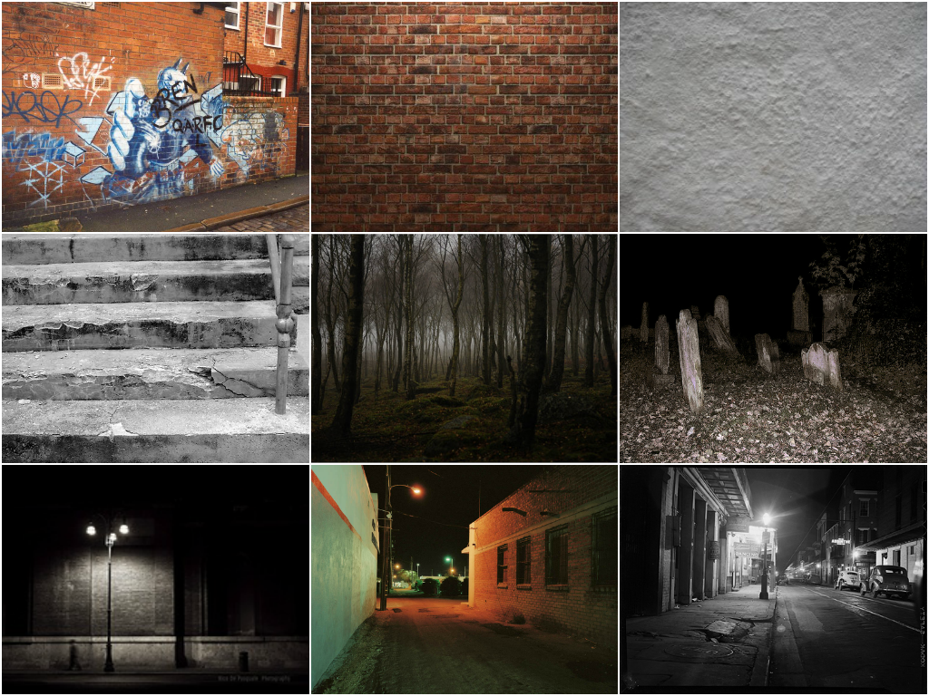
Colours
– The colour scheme I have chosen for my magazine are dark
colours like black, grey, and dark reds. To contrast with the dark colours I
would also use white. I have decided to use darker colours to conceive a dark,
mysterious portrayal that works well with the genre of music and the
sound/appearance of the artists that I will be including in the magazine.
Colours are important to signify the genre of the magazine and to create an
‘atmosphere’ for the reader. When
somebody introduces the genre of alternative rock/grunge, the immediate image
that comes to mind is not bright and colourful, darker colours are more
relatable and fitting for the magazine. The colours will overall make a bold
statement and bring out the music type and artists included in the magazine.
Solid, dark colours will also work well with a bold font, and will make the
appearance look suited and correlated.


Fonts – The font of the magazine is important too, not only on
the front page but inside the magazine on the contents page and with the
articles etc. This is because it is what the reader is constantly looking at
and reading. It needs to be clear and easy to see but it also needs to be
suited to the magazine itself and work well alongside the colour scheme and
layout. For my magazine I have decided to use a bold font, sometimes in capital
letters for the article titles, straplines, sell lines and any significant text
that I want to stand out. For normal text I will use a normal everyday fonts
such as Arial, Verdana,
Calibri
(Body) or Century Gothic. This is because it needs to be easily read and not
distracting from the colours, layout, images in the article and everything
else. For the masthead however I decided to be more creative and give it an
edgy, different look. This is to give the front cover a different, unique appearance
and to ultimately attract people towards the magazine. Two of my main colours
are black and white, this will make the rest of the colours fit in and
look appropriate together. Although the masthead font is slightly
eroded/destroyed with the black detail on the main white font, it is still easy
and clear to read and will still be understandable. This is why I chose the
particular font, it is different and outgoing but it still fulfils the job of
being easy to recognise.

Layout – My magazine will have
a clear layout to ensure it is easy to follow and read. For my feature
articles I have chosen to have a three column layout. This is a traditional
layout style for feature articles, and allows it to be read smoothly and
easily. For my contents I will use two columns, this is because there isn’t as
much information and text that needs to be read, so therefore it wouldn’t look
as professional spread out in more than two columns and would make the page look
sparse. On all of my pages I will use a variety of pictures of my main artists as well as others. This will add to the pages and make them more exciting and stand out.


.jpg)